
20.1 – Volatility Smile
We had briefly looked at inter Greek interactions in the previous chapter and how they manifest themselves on the options premium. This is an area we need to explore in more detail, as it will help us select the right strikes to trade. However before we do that we will touch upon two topics related to volatility called ‘Volatility Smile’ and ‘Volatility Cone’.
Volatility Smile is an interesting concept, something that I consider ‘good to know’ kind of concept. For this reason I will just touch upon this and not really dig deeper into it.
Theoretically speaking, all options of the same underlying, expiring on the same expiry day should display similar ‘Implied Volatilities’ (IV). However in reality this does not happen.
Have a look at this image –
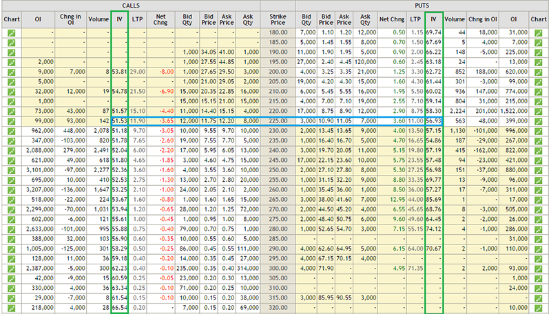
This is the option chain of SBI as of 4th September 2015. SBI is trading around 225, hence the 225 strike becomes ‘At the money’ option, and the same is highlighted with a blue band. The two green bands highlight the implied volatilities of all the other strikes. Notice this – as you go away from the ATM option (for both Calls and Puts) the implied volatilities increase, in fact further you move from ATM, the higher is the IV. You can notice this pattern across all the different stocks/indices. Further you will also observe that the implied volatility of the ATM option is the lowest. If you plot a graph of all the options strikes versus their respective implied volatility you will get to see a graph similar to the one below –
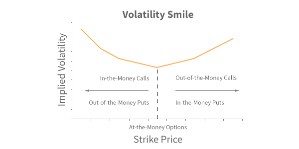
The graph appears like a pleasing smile; hence the name ‘Volatility Smile’ ☺
20.2 – Volatility Cone
(All the graphs in this chapter and in this section on Volatility Cone has been authored by Prakash Lekkala)
So far we have not touched upon an option strategy called ‘Bull Call Spread’, but for the sake of this discussion I will make an assumption that you are familiar with this strategy.
For an options trader, implied volatility of the options greatly affects the profitability. Consider this – you are bullish on stock and want to initiate an option strategy such as a Bull Call Spread. If you initiate the trade when the implied volatility of options is high, then you will have to incur high upfront costs and lower profitability potential. However if you initiate the position when the option implied volatility is low, your trading position will incur lower costs and higher potential profit.
 For instance as of today, Nifty is trading at 7789. Suppose the current implied volatility of option positions is 20%, then a 7800 CE and 8000 CE bull call spread would cost 72 with a potential profit of 128. However if the implied volatility is 35% instead of 20%, the same position would cost 82 with potential profit of 118. Notice with higher volatility a bull call spread not only costs higher but the profitability greatly reduces.
So the point is for option traders , it becomes extremely crucial to assess the level of volatility in order to time the trade accordingly. Another problem an option trader has to deal with is, the selection of the underlying and the strike (particularly true if your strategies are volatility based).
For example – Nifty ATM options currently have an IV of ~25%, whereas SBI ATM options have an IV of ~52%, given this should you choose to trade Nifty options because IV is low or should you go with SBI options?
This is where the Volatility cone comes handy – it addresses these sorts of questions for Option traders. Volatility Cone helps the trader to evaluate the costliness of an option i.e. identify options which are trading costly/cheap. The good news is, you can do it not only across different strikes of a security but also across different securities as well.
Let’s figure out how to use the Volatility Cone.
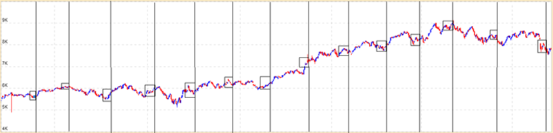
Below is a Nifty chart for the last 15 months. The vertical lines mark the expiry dates of the derivative contracts, and the boxes prior to the vertical lines mark the price movement of Nifty 10 days prior to expiry.
If you calculate the Nifty’s realized volatility in each of the boxes, you will get the following table –
| Expiry Date | Annualized realized volatility |
|---|---|
| Jun-14 | 41% |
| Jul-14 | 38% |
| Aug-14 | 33% |
| Sep-14 | 28% |
| Oct-14 | 28% |
| Nov-14 | 41% |
| Dec-14 | 26% |
| Jan-15 | 22% |
| Feb-15 | 56% |
| Mar-15 | 19% |
| Apr-15 | 13% |
| May-15 | 34% |
| Jun-15 | 17% |
| Jul-15 | 41% |
| Aug-15 | 21% |
From the above table we can observe that Nifty’s realized volatility has ranged from a maximum of 56% (Feb 2015) to a minimum of 13% (April 2015).
We can also calculate mean and variance of the realized volatility, as shown below –
| Particulars | Details |
|---|---|
| Maximum Volatility | 56% |
| +2 Standard Deviation (SD) | 54% |
| +1 Standard Deviation (SD) | 42% |
| Mean/ Average Volatility | 31% |
| -1 Standard Deviation (SD) | 19% |
| -2 Standard Deviation (SD) | 7% |
| Minimum Volatility | 13% |
If we repeat this exercise for 10, 20, 30, 45, 60 & 90 day windows, we would get a table as follows –
| Days to Expiry | 10 | 20 | 30 | 45 | 60 | 90 |
|---|---|---|---|---|---|---|
| Max | 56% | 49% | 41% | 40% | 37% | 35% |
| +2 SD | 54% | 46% | 42% | 41% | 40% | 38% |
| +1 SD | 42% | 38% | 36% | 36% | 35% | 33% |
| Mean/Average | 30% | 29% | 30% | 30% | 30% | 29% |
| -1 SD | 19% | 21% | 23% | 24% | 24% | 24% |
| -2 SD | 7% | 13% | 17% | 19% | 19% | 19% |
| Min | 13% | 16% | 21% | 22% | 21% | 20% |
The graphical representation of the table above would look like a cone as shown below, hence the name ‘Volatility Cone’ –
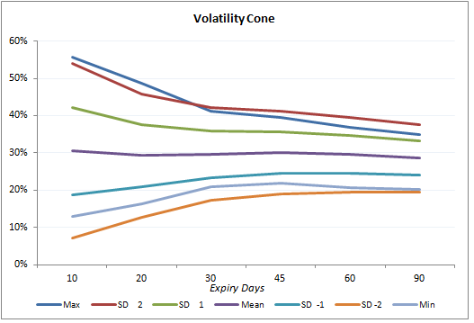
The way to read the graph would be to first identify the ‘Number of days to Expiry’ and then look at all the data points that are plotted right above it. For example if the number of days to expiry is 30, then observe the data points (representing realized volatility) right above it to figure out the ‘Minimum, -2SD, -1 SD, Average implied volatility etc’. Also, do bear in mind; the ‘Volatility Cone’ is a graphical representation on the ‘historical realized volatility’.
Now that we have built the volatility cone, we can plot the current day’s implied volatility on it. The graph below shows the plot of Nifty’s near month (September 2015) and next month (October 2015) implied volatility on the volatility cone.
Each dot represents the implied volatility for an option contract – blue are for call options and black for put options.
For example starting from left, look at the first set of dots – there are 3 blue and black dots. Each dot represents an implied volatility of an option contract – so the first blue dot from bottom could be the implied volatility of 7800 CE, above that it could be the implied volatility of 8000 CE and above that it could be the implied volatility of 8100 PE etc.
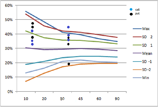
Do note the first set of dots (starting form left) represent near month options (September 2015) and are plotted at 12 on x-axis, i.e. these options will expire 12 days from today. The next set of dots is for middle month (October 2015) plotted at 43, i.e. these options will expire 43 days from today.
Interpretation
Look at the 2nd set of dots from left. We can notice a blue dot above the +2SD line (top most line, colored in maroon) for middle month option. Suppose this dot is for option 8200 CE, expiring 29-Oct-2015, then it means that today 8200 CE is experiencing an implied volatility, which is higher (by +2SD) than the volatility experienced in this stock whenever there are “43 days to expiry” over the last 15 months [remember we have considered data for 15 months]. Therefore this option has a high IV, hence the premiums would be high and one can consider designing a trade to short the ‘volatility’ with an expectation that the volatility will cool off.
Similarly a black dot near -2 SD line on the graph, is for a Put option. It suggests that, this particular put option has very low IV, hence low premium and therefore it could be trading cheap. One can consider designing a trade so as to buy this put option.
A trader can plot volatility cone for stocks and overlap it with the option’s current IV. In a sense, the volatility cone helps us develop an insight about the state of current implied volatility with respect to the past realized volatility.
Those options which are close to + 2SD line are trading costly and options near -2 SD line are considered to be trading cheap. Trader can design trades to take advantage of ‘mispriced’ IV. In general, try to short options which are costlier and go long on options which are trading cheap.
Please note: Use the plot only for options which are liquid.
With this discussion on Volatility Smile and Volatility Cone, hopefully our understanding on Volatility has come to a solid ground.
20.3 – Gamma vs Time
Over the next two sections let us focus our attention to inter greek interactions.
Let us now focus a bit on greek interactions, and to begin with we will look into the behavior of Gamma with respect to time. Here are a few points that will help refresh your memory on Gamma –
- Gamma measures the rate of change of delta
- Gamma is always a positive number for both Calls and Puts
- Large Gamma can translate to large gamma risk (directional risk)
- When you buy options (Calls or Puts) you are long Gamma
- When you short options (Calls or Puts) you are short Gamma
- Avoid shorting options which have a large gamma
The last point says – avoid shorting options which have a large gamma. Fair enough, however imagine this – you are at a stage where you plan to short an option which has a small gamma value. The idea being you short the low gamma option and hold the position till expiry so that you get to keep the entire option premium. The question however is, how do we ensure the gamma is likely to remain low throughout the life of the trade?
The answer to this lies in understanding the behavior of Gamma versus time to expiry/maturity. Have a look at the graph below –
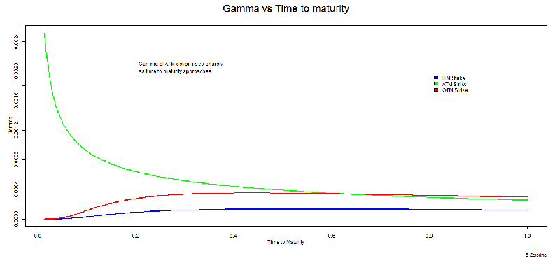
The graph above shows how the gamma of ITM, ATM, and OTM options behave as the ‘time to expiry’ starts to reduce. The Y axis represents gamma and the X axis represents time to expiry. However unlike other graphs, don’t look at the X – axis from left to right, instead look at the X axis from right to left. At extreme right, the value reads 1, which suggests that there is ample time to expiry. The value at the left end reads 0, meaning there is no time to expiry. The time lapse between 1 and 0 can be thought of as any time period – 30 days to expiry, 60 days to expiry, or 365 days to expiry. Irrespective of the time to expiry, the behavior of gamma remains the same.
The graph above drives across these points –
- When there is ample time to expiry, all three options ITM, ATM, OTM have low Gamma values. ITM option’s Gamma tends to be lower compared to ATM or OTM options
- The gamma values for all three strikes (ATM, OTM, ITM) remain fairly constant till they are half way through the expiry
- ITM and OTM options race towards zero gamma as we approach expiry
- The gamma value of ATM options shoot up drastically as we approach expiry
From these points it is quite clear that, you really do not want to be shorting “ATM” options, especially close to expiry as ATM Gamma tends to be very high.
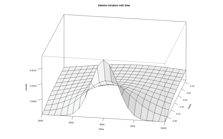
In fact if you realize we are simultaneously talking about 3 variables here – Gamma, Time to expiry, and Option strike. Hence visualizing the change in one variable with respect to change in another makes sense. Have a look at the image below –
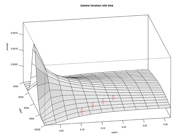
The graph above is called a ‘Surface Plot’, this is quite useful to observe the behavior of 3 or more variables. The X-axis contains ‘Time to Expiry’ and the ‘Y axis’ contains the gamma value. There is another axis which contains ‘Strike’.
There are a few red arrows plotted on the surface plot. These arrows are placed to indicate that each line that the arrow is pointing to, refers to different strikes. The outermost line (on either side) indicates OTM and ITM strikes, and the line at the center corresponds to ATM option. From these lines it is very clear that as we approach expiry, the gamma values of all strikes except ATM tends to move towards zero. The ATM and few strikes around ATM have non zero gamma values. In fact Gamma is highest for the line at the center – which represents ATM option.
We can look at it from the perspective of the strike price –
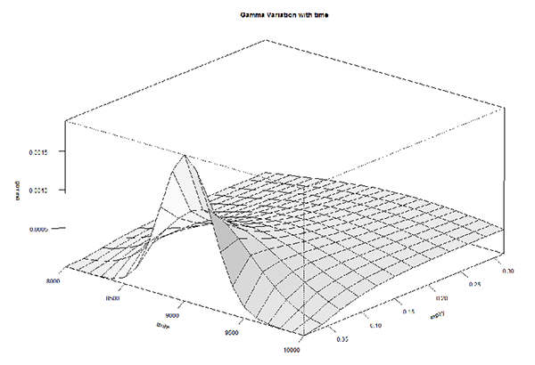
This is the same graph but shown from a different angle, keeping the strike in perspective. As we can see, the gamma of ATM options shoot up while the Gamma of other option strikes don’t.
In fact here is a 3D rendering of Gamma versus Strike versus Time to Expiry. The graph below is a GIF, in case it refuses to render properly, please do click on it to see it in action.
Hopefully the animated version of the surface plot gives you a sense of how gamma, strikes, and time to expiry behave in tandem.
20.4 – Delta versus implied volatility
These are interesting times for options traders, have a look at the image below –
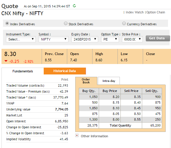
The snapshot was taken on 11th September when Nifty was trading at 7,794. The snapshot is that of 6800 PE which is currently trading at Rs.8.3/-.
Figure this, 6800 is a good 1100 points way from the current Nifty level of 7794. The fact that 6800 PE is trading at 8.3 implies there are a bunch of traders who expect the market to move 1100 points lower within 11 trading sessions (do note there are also 2 trading holidays from now to expiry).
Given the odds of Nifty moving 1100 (14% lower from present level) in 11 trading sessions are low, why is the 6800 PE trading at 8.3? Is there something else driving the options prices higher besides pure expectations? Well, the following graph may just have the answer for you –
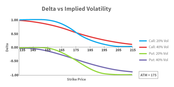
The graph represents the movement of Delta with respect to strike price. Here is what you need to know about the graph above –
- The blue line represents the delta of a call option, when the implied volatility is 20%
- The red line represents the delta of a call option, when the implied volatility is 40%
- The green line represents the delta of a Put option, when the implied volatility is 20%
- The purple line represents the delta of a Put option, when the implied volatility is 40%
- The call option Delta varies from 0 to 1
- The Put option Delta varies from 0 to -1
- Assume the current stock price is 175, hence 175 becomes ATM option
With the above points in mind, let us now understand how these deltas behave –
- Starting from left – observe the blue line (CE delta when IV is 20%), considering 175 is the ATM option, strikes such as 135, 145 etc are all Deep ITM. Clearly Deep ITM options have a delta of 1
- When IV is low (20%), the delta gets flattened at the ends (deep OTM and ITM options). This implies that the rate at which Delta moves (further implying the rate at which the option premium moves) is low. In other words deep ITM options tends to behave exactly like a futures contract (when volatility is low) and OTM option prices will be close to zero.
- You can observe similar behavior for Put option with low volatility (observe the green line)
- Look at the red line (delta of CE when volatility is 40%) – we can notice that the end (ITM/OTM) is not flattened, in fact the line appears to be more reactive to underlying price movement. In other words, the rate at which the option’s premium change with respect to change in underlying is high, when volatility is high. In other words, a large range of options around ATM are sensitive to spot price changes, when volatility is high.
- Similar observation can be made for the Put options when volatility is high (purple line)
- Interestingly when the volatility is low (look at the blue and green line) the delta of OTM options goes to almost zero. However when the volatility is high, the delta of OTM never really goes to zero and it maintains a small non zero value.
Now, going back to the initial thought – why is the 6800 PE, which is 1100 points away trading at Rs.8.3/-?
Well that’s because 6800 PE is a deep OTM option, and as the delta graph above suggests, when the volatility is high (see image below), deep OTM options have non zero delta value.
I would suggest you draw your attention to the Delta versus IV graph and in particular look at the Call Option delta when implied volatility is high (maroon line). As we can see the delta does not really collapse to zero (like the blue line – CE delta when IV is low). This should explain why the premium is not really low. Further add to this the fact that there is sufficient time value, the OTM option tends to have a ‘respectable’ premium.
Download the Volatility Cone excel.
Key takeaways from this chapter
- Volatility smile helps you visualize the fact that the OTM options usually have high IVs
- With the help of a ‘Volatility Cone’ you can visualize today’s implied volatility with respect to past realized volatility
- Gamma is high for ATM option especially towards the end of expiry
- Gamma for ITM and OTM options goes to zero when we approach expiry
- Delta has an effect on lower range of options around ATM when IV is low and its influence increases when volatility is high.
- When the volatility is high, the far OTM options do tend to have a non zero delta value
This one is tough to understand….Need to read 2/3 times.
This is indeed a tricky concept Sir, but not tough :).
Please do let me know which part you are finding difficult…I will be happy to take you through it.
Gamma Variation with Time Graph.
On this graph, due to the introduction of Surface Line, I m not able to plot the actual line of OTM, ITM and ATM exactly,
And as I am stuck on this I am not able to read those followed graphs. Could you please help me with it.
This can be a quite challenging, Ravindra. How are you generating this graph? You need a 3D surface plot for this. I took my friend’s help in rendering this in Matlab.
So Sir can we assume that as of the above stated graph of “Gamma vs Time to Maturity” can we mash-up that with “Gamma Variation with time” to help myself read the graph ignoring those mentioned Red Arrows ?
Will that be a good attempt to start reading 3D graphs ?
Hmm, sort of. If I’m not wrong, I think the Gamma vs Maturity represents that of an OTM.
Dear Mr. Karthik Rangappa,
Can you please explain as to how you arrive at 1 SD and 2 SD under volatility cone?
Thanking you,
P.K.Ramakrishnan
Sir, its explained in the chapter.
Dear Sir,
Thank yor for your valuable contribution. Can we have topic on how to read option chain?
Check this, Abhay – https://zerodha.com/varsity/chapter/moneyness-of-an-option-contract/
Sorry Karthik,
But I too can not understand how you arrived at 1SD and 2SD under volatility cone.
Thanks.
Where exactly is the problem, Ram?
Karthik how did you plot the points there ??
These were developed on R software, Sapan.
this was really educative and very informative. but where can we find volatility cone live for nifty options? Also need some help to select proper strike. where can i find high volumes, with delta and implied volatility values in table form but live during market hours? thanx for ur help
Suresh – you need to comprehend all the Greeks to identify the best possible strikes. However towards the end of this module, I will share few pointers on this. For all other variables you can use a standard B&S options calculator, which is the focus of the next chapter (chapter 21).
Volatility cone is a very interesting concept – I cant guarantee, but we will try and develop a web based tool for this sometime soon.
Sir, I am doing option trading, till date i had not write any option, just doing buy & square off both call & put option. You are explaining the things quiet easily. But i want to know from where we can plot this graph & find the right time to enter as you know for trading the option is fast process. Thanks in advance.
Deval – unfortunately Options cant be traded based on charts. As you can see there are many dimensions for Options trading which goes beyond simple charting. For successful options trading you need to develop a deeper understanding of Greeks and associated theory…which is the focus of this entire module.
hi karthik, how do we plot the volatility cone? what platform do we use for the same? secondly, how is the annualized realized volatility and hence its mean and variance calculated? thanks.
You can plot the Volatility cone on excel, although the logic could be a bit tricky. For the calculations, I will try and put up an excel sometime soon.
Although Karthik has already answered this, but may I still suggest that if you are familiar with MATLAB; plotting of volatility cone using MATLAB is lot easier.
Oh yes, MATLAB is good…in fact even ‘R’ is good.
Well thanks karthik/sunil. is there a way to learn how to plot the cone on MATLAB or R….i am not aware of either of them. secondly when you calculate option greeks, the inputs that are dynamic are spot price and IV. both of them change constantly. when you keep changing them on the calculator, you can see the delta and vega go up with an increase in IV. the gamma remains constant. this was for an OTM call option of bank nifty… i need to know, if we have to constantly calculate the same as the price and IV change or just decide the underlying will move by X and calculate the premium( based on delta and gamma)? i mean summing all and taking the correct strike is proving difficult. thanks.
Not sure about learning MATLAB, R etc. Maybe you should try Coursera, they may have a course there for free.
Yes, the greeks are dynamic. On a normal day when the volatility is not much I dont really calculate the greeks constantly…once a day before initiating my trade usually works for me.
hi karthik, following is the calculation of Infosys CE1160 september 2015. : life of option – 2 days (calculated today)
interest rate @ 7 %
security price @ 1128
strike @ 1160
volatility @35.95
option price @2.413 ( as per calculator)
delta@ 0.1548
gamma @0.0079
theta @ -1.7231
vega @ 0.2002
with this information, if underlying moves by x, we know the movement of premium thanks to delta and gamma. what else can we infer? apart from the fact that the option will lose value due to theta and the impact of volatility on the premium due to vega. do comment. thanks.
Well, it is just about that 🙂 Most of the times you end up using Delta, Gamma, and IV data…the rest of the numbers helps you quantify. For example if all else stays the same I know the premium will drop by 1.7231 points t’row (thanks to Theta).