“How do I select an actively managed mutual fund?” and “What metrics should I check?” are among the most common questions we see from mutual fund investors.
That is exactly why we thought of starting a weekly infographic series called ‘Know Your Fund’ that breaks down the important things to consider. It combines all the important metrics, such as returns, risk ratios, consistency, costs, and portfolio characteristics, along with category comparisons, into a single visual for a quick look.
We have spent numerous hours shaping this infographic, and it has gone through several iterations. While it may look simple on the surface, there is a lot that has gone into it, from deciding what to show and what not to show, to working through the calculations underneath, to figuring out how to present it in a way. We really hope you will find value in this series. This is what it looks like:
You will see us decoding one fund each week on our socials – Twitter and LinkedIn.
While this is not a full substitute for detailed fund research, it gives you a strong starting point. Here, we share the methodology behind creating the infographic.
Which funds do we cover?
We select funds based on two criteria:
- We go by the AUM (assets under management) size of the fund. Each week, we pick one fund.
- We consider only those funds with at least 10 years of existence (at least to start with) because that typically covers multiple market cycles (bull runs, corrections, and recoveries).
What this does not cover
The fund manager’s investment style and philosophy is also very important whether they are value-oriented, growth-focused, contrarian, or momentum-driven. This influences how the fund behaves in different market conditions. The infographic shows you the outcomes (returns, risk, consistency) but not the process behind them. We have a video series on YouTube explaining just that, if you want to check.
Important: This is not a fund recommendation. All metrics are based on past history and past performance does not guarantee future results. Use this as one input among many in your investment decision-making process.
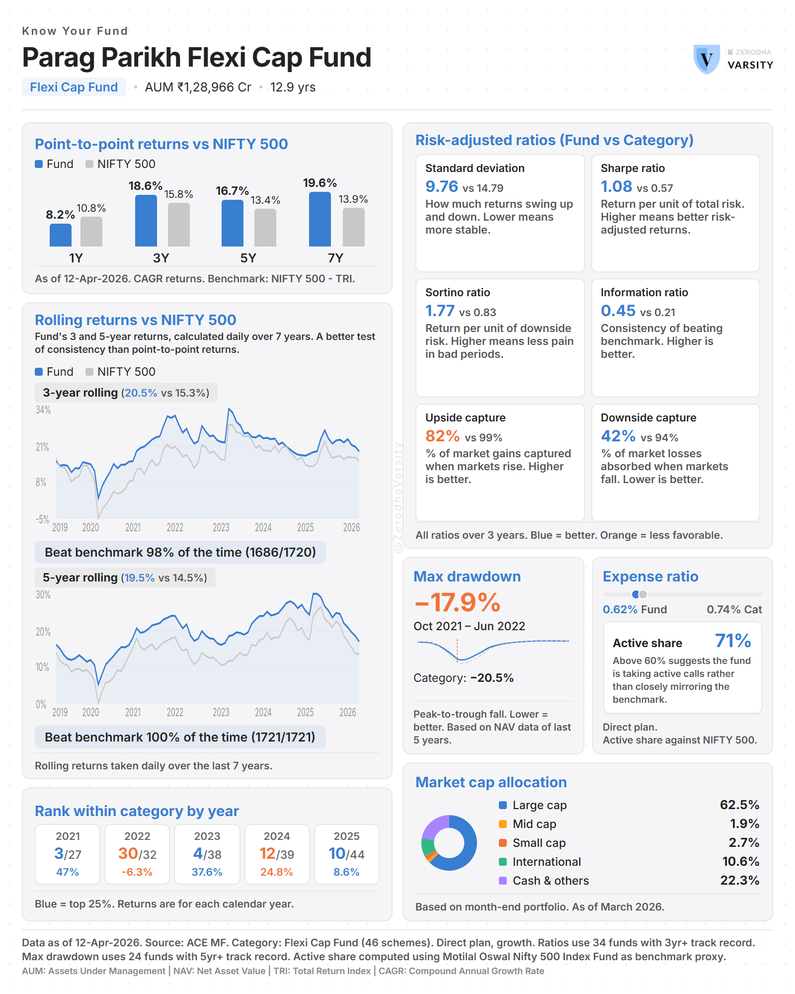
33.1 – Trailing returns
What is it? The fund’s total return over the last 1, 3, 5, and 7 years, shown as annualised CAGR (Compound Annual Growth Rate). Displayed as a grouped bar chart comparing the fund (blue) against its benchmark (grey).
Why it matters
- 1-Year — Is the fund keeping up with the market right now?
- 3-Year — The minimum evaluation window most advisors use. Smooths out short-term noise.
- 5-Year — Long-term track record through at least one market cycle.
- 7-Year — Extended record. Very few funds can consistently beat benchmarks over this period.
How is it calculated? Point-to-point CAGR returns sourced directly from ACE MF. Benchmark returns use the Total Return Index (TRI), which includes dividends reinvested, giving a fairer comparison than the price-only index.
Source: ACE MF database. Direct plan (or Regular plan — noted in footnote), growth option.
33.2 – Rolling returns
What is it? Instead of looking at just one 3-year period, rolling returns calculate the 3-year return starting from every single day in the fund’s history. Same for 5-year periods. This creates hundreds of data points, showing how the fund performed across all possible entry and exit points.
Why it matters Trailing returns show you one snapshot. Rolling returns show you consistency.
A fund with a 3-year beat rate of 95% has beaten its benchmark in 95 out of every 100 rolling 3-year periods, a genuinely consistent outperformer.
A fund with a 3-year beat rate of 55% barely edges out the benchmark. After expenses, you might be better off with an index fund.
We show both 3-year and 5-year rolling returns.
How is it calculated? For each trading day, calculate the annualised return over the preceding 3 (or 5) years. Beat percentage = number of days the fund beat the benchmark divided by total periods..
Source: Daily NAV data from ACE MF for both fund and benchmark (TRI).
33.3 – Calendar year rankings
What is it? The fund’s performance rank within its category for each calendar year. Shown as rank/total — for example, 3/27 means the fund was the 3rd best performer out of 27 funds in its category that year.
Why it matters A fund’s absolute return in a single year doesn’t tell you much — the whole market might have been up 30%. What matters is: compared to peers with the same mandate, where did this fund land?
Consistent top-quartile rankings (highlighted in blue) across years indicate strong fund management. Wildly swinging rankings suggest concentrated bets. Consistent bottom-quartile is a red flag.
How is it calculated? For each year, all funds in the category with a full year of returns are ranked by return in descending order (highest return = Rank 1). Only funds that existed for the entire calendar year are included.
Top 25% threshold (blue highlight): rank is at or below ceiling(total / 4).
Source: Calendar year returns from ACE MF for all schemes in the category.
33.4 – Risk-adjusted ratios
Six metrics comparing the fund against the category average. Only funds with 3+ years of track record are included in the average. Younger funds don’t have enough history for meaningful comparison.
Standard Deviation — Lower is better How much returns swing up and down. Lower volatility means a smoother ride. Two funds with the same return are not equal if one had wild swings and the other was steady.
Sharpe Ratio — Higher is better Return earned per unit of total risk taken. Tells you if the fund’s returns are worth the risk. A fund returning 15% steadily can have a better Sharpe than one returning 20% with high volatility.
Sortino Ratio — Higher is better Like Sharpe, but only penalises downside volatility. Upside surprises aren’t counted against the fund. Arguably a fairer measure since investors worry about losses, not gains.
Information Ratio — Higher is better How consistently the fund beats its benchmark, per unit of tracking error. Above 0.5 is good; above 1.0 is exceptional. Tells you if outperformance is reliable or erratic.
Upside Capture — Higher is better When the benchmark goes up, what percentage of that gain does the fund capture? Above 100% means the fund gains more than the benchmark in rising markets.
Downside Capture — Lower is better When the benchmark falls, what percentage of that fall does the fund experience? Below 100% means the fund falls less than the market. The best funds have high upside capture AND low downside capture.
Blue = fund is better than category average. Orange = fund is worse.
Source: ACE MF. All ratios calculated over trailing 3 years.
33.5 – Max drawdown
What is it? The worst peak-to-trough fall in the fund’s NAV over the data period. If the NAV reached Rs 200, then fell to Rs 160 before recovering, the drawdown is -20%. It answers: “What was the worst I could have experienced?”
Lower (closer to 0%) is better.
Why it matters Returns alone don’t tell you about pain. A fund might deliver 18% CAGR but at one point dropped 35% from peak — could you have held through that without panic selling?
Compare against the category average: if the fund’s drawdown is significantly less than peers, the manager was more defensive or better diversified during the downturn.
How is it calculated?
- Take daily NAV data for the period.
- Running peak: at each date, the highest NAV achieved so far. This only ratchets upward.
- Drawdown at each date = (Today’s NAV – Running Peak) / Running Peak.
- Max Drawdown = the most negative drawdown across all dates.
- Record the peak date (before the fall) and trough date (the bottom).
Category average: each qualifying fund’s (5+ years) max drawdown is calculated individually, then averaged.
Source: Daily NAV data from ACE MF.
33.6 – Expense ratio
What is it? The annual fee the fund charges, as a percentage of your investment. Deducted daily from the NAV — you never see a separate charge, but it erodes your returns every day.
Lower is better.
Why it matters Expense ratio is the one thing you can control. Returns are uncertain; fees are guaranteed to be deducted.
A 1% difference in expense ratio over 20 years on Rs 10 lakh (at 12% gross return) costs approximately Rs 7-8 lakh in lost wealth. Small differences compound dramatically.
If a fund charges significantly more than peers, the manager needs proportionally higher gross returns just to match average net returns — a structural disadvantage.
How is it calculated? Fund’s expense ratio is sourced directly from the fund factsheet / ACE MF database. We note whether it’s the Regular plan or Direct plan TER (Total Expense Ratio).
Category average: simple average of ALL funds in the category with expense data. No age filter — expense ratio is a current operational metric.
Source: ACE MF database / fund factsheet.
33.7 – Active share
What is it? A measure of how different the fund’s portfolio is from its benchmark index. Ranges from 0% (identical to benchmark) to 100% (completely different).
Higher means more active management.
Why it matters High active share (above 60-70%): the fund manager is not hugging the benchmark index. The fund manager is taking active calls and investing in a way that is different than a passive index fund. You’re paying for genuine active management.
Low active share (below 30-40%): the fund closely resembles the index. You’re paying active fees for near-index performance; consider a cheaper index fund.
Low active share combined with high expense ratio is a red flag: you’re paying for active management but not getting it.
Having said that, a high active share is not a guarantee of outperformance. It simply indicates that the fund is constructed differently from the benchmark. While it justifies a higher expense ratio compared to a passive index fund (as you are paying for active decision-making), it also means the fund has the potential to underperform the benchmark significantly if the manager’s active bets do not pay off.
How is it calculated?
- Take the fund’s FULL portfolio — every holding: equities, debt, cash, overseas stocks, REITs, everything. Not just equities. Every allocation decision counts.
- Take the benchmark’s portfolio using an ETF tracking the index as a proxy.
- For every instrument in either portfolio: calculate the absolute difference between fund weight and benchmark weight. If a stock is in one but not the other, the missing weight is 0.
- Active Share = sum of all absolute differences divided by 2.
Source: Fund portfolio from ACE MF. Benchmark proxy: ETF portfolio tracking the relevant index.
33.8 – Market cap / Sectoral allocation
What is it? How the fund’s portfolio is distributed across company sizes: Large Cap, Mid Cap, Small Cap, International (overseas equities), and Cash & Others (debt, cash, REITs, and other non-equity holdings). For categories with mandated allocations (like Large Cap funds), sectoral allocation may be shown instead.
Why it matters
- Investment mandate compliance — a Flexi Cap fund has full freedom, but if it’s 90% large cap, it’s behaving like a large cap fund.
- Risk profile — higher small/mid cap means higher growth potential but more volatility.
- Cash holding — high cash (above 10%) signals caution. Very low cash means fully invested.
- International exposure provides geographic diversification beyond Indian markets.
How is it calculated? Market cap breakdown is sourced from ACE MF portfolio data. The “Others” category is automatically split: overseas equities are separated as “International” and everything else (debt, cash, money market, REITs) is grouped as “Cash & Others.”
Source: ACE MF portfolio holdings data. Latest available portfolio disclosure.
Glossary
CAGR — Compound Annual Growth Rate. The smoothed annual return that gets you from start value to end value over a period.
TRI — Total Return Index. Includes dividends reinvested, giving a fairer benchmark comparison than the price-only index.
NAV — Net Asset Value. The per-unit price of the fund, calculated daily after all expenses are deducted.
Tracking Error — How much the fund’s returns deviate from the benchmark on a day-to-day basis.
Risk-free Rate — The return from a zero-risk investment (typically government securities). Used as the baseline in Sharpe and Sortino calculations.
TER — Total Expense Ratio. The all-in annual fee including management fee, admin costs, and all other charges.
Quartile — Dividing ranked funds into 4 equal groups. Top quartile = top 25% of performers.
Peak-to-trough — From the highest point to the lowest point before recovery begins.
Running Peak — The highest NAV achieved up to any given date. Only goes up, never down. Also called high-water mark.
Active Share — Percentage measure of how different a fund’s holdings are from its benchmark. 0% = identical, 100% = completely different.
Direct Plan — Fund plan without distributor commission, resulting in lower expense ratio.
Regular Plan — Fund plan that includes distributor commission in the expense ratio. Higher TER than Direct plan.
For educational and informational purposes only. Not investment advice.
How your IR comes to be 0.12, Sharpe as 0.45, SD as 2.63? These numbers vary with what Third party providers give and my spreadsheet which b calculate this from AMFI daily data is very different from yours. Can you share your base sheet?
Hi Rahul,
Which fund are you talking about? usually, out Sharpe ratio and standard deviation matches with ValueResearch, and the upside and downside capture ratio with Morningstar.
Mr Karthik,
Heartfelt thanks for such easy to understand, in depth sessions. Truly thankful for teaching all this to a person who\’s already very late(but definitely highly motivated now)for the journey.
I am reading it all in 2026; I hope all this matter still applies the same?!!(DO ANSWER PLEASE)
Thanks again for these enriching lessons.
How to subscribe in WhatsApp?
Here\’s the link, Rajen
https://whatsapp.com/channel/0029VbCfykd4NVimlBSkFk0O
FUND AUM impact returns?how plz explain specially for PPFAS FLEXI AND Nippon small cap.where should we consider AUM is large ?when we should be cautious about AUM
Hi
When a fund is large, it needs to deploy a lot of money. To buy a stock, it has to buy a lot of it. To sell, it has to sell a lot. This pushes prices against the fund — buying drives the price up before they finish buying, selling drives it down before they finish selling. That\’s called market impact. This could happen especially for funds in the mid cap and small cap space, where liquidity is lower than what we see in the large cap space.
Very informative article. Please do the same for Axis Small Cap MF.
We will cover more funds 🙂
Thanks Souvik.
We have been covering one fund every week. They are being published on our Zerodha Varsity social media platforms – Twitter, LinkedIn, Whatsaapp and Substack. You can check them there.
Could you please post detailed report of other funds
Hi Gagan,
We plan to release analysis of one fund each week, every Tuesday. This will be published on our socials – Twitter and LinkedIn.
Nice information