Introducing the Portfolio Performance Curve on Console
The Portfolio Performance Curve shows the actual performance of your investments and trades (equity, mutual funds (MF), MTF, F&O, intraday, and commodities) after accounting for cash inflows and outflows.
Looking at the absolute P&L of your portfolio does not tell you anything about your performance because it is just a snapshot in time. To accurately assess your portfolio’s performance, you need to analyse returns over time while excluding cash inflows and outflows, then compare this performance against a reasonable benchmark.
That is why, to help you understand your investment and trading performance accurately, we are introducing the Portfolio Performance Curve on Console. This feature, now available for the first time to Indian investors, separates your actual investment and trading performance while adjusting for cash inflows and outflows, providing a more accurate picture of how your trading account is performing.
What is the Portfolio Performance Curve?
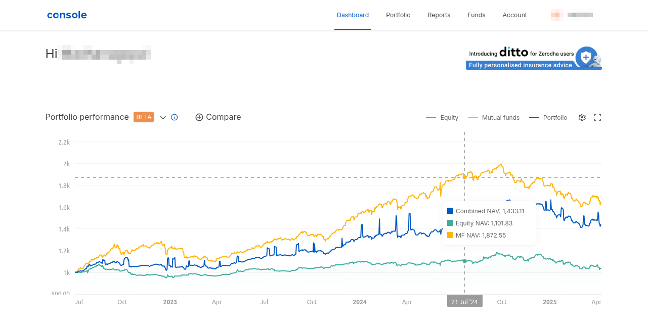
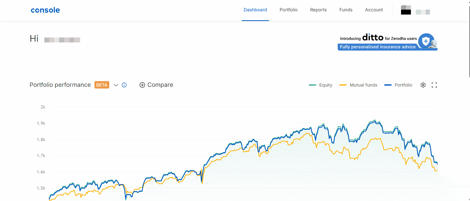
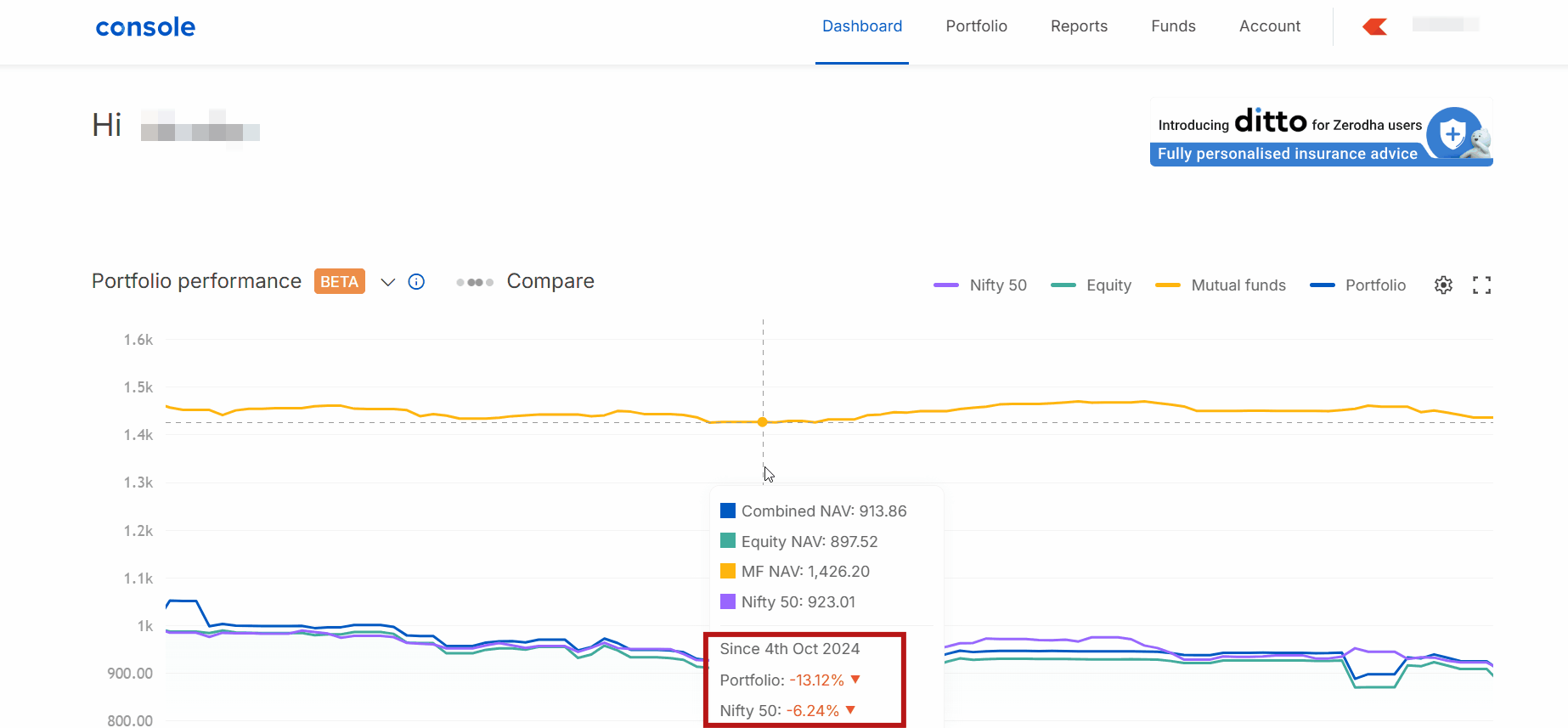
Similar to how mutual funds use an NAV curve to represent performance, the Portfolio Performance Curve applies the same principle to your entire trading account. It shows you how your investments and trades (F&O and intraday) are performing over different time periods and lets you compare your performance with the NIFTY 50 index in a simple, visual way. You can view the Portfolio Performance Curve by visiting Console’s Dashboard.
How the Performance Curve works
The Portfolio Performance Curve starts with a base Net Asset Value (NAV) of ₹1,000. This is set from July 1, 2022, or from the date your account first reaches ₹1,000—whichever comes first.
When you add money to your account, new units are created based on the previous day’s NAV. Similarly, when you withdraw funds, units are reduced from today’s NAV. This ensures that your performance curve only includes your actual investment and trading returns, not cash inflows or outflows.
Let us understand this with a simple example:
Suppose your account starts with ₹10,000, and you decide to add ₹5,000 later. On a typical account value curve, this would appear as a 50% increase. However, this jump does not represent actual profits—it is simply the result of adding more capital.
Here is how the Performance Curve handles this situation:
- Your account value is ₹10,000 and the NAV is ₹1,000
- Total units: 10 (₹10,000 ÷ ₹1,000)
- When you add ₹5,000, 5 new units are created (₹5,000 ÷ ₹1,000)
- You now have 15 units in total (10 original units + 5 new units).
- Since the NAV remains at ₹1,000, your total value is ₹15,000 (15 units × ₹1,000 NAV), but the Performance Curve correctly shows that there has been no actual profit or loss
How the NAV changes with market movements
To understand how the curve reflects real portfolio performance, consider the following scenario:
- Day 1: Your NAV is ₹1,000 with 10 units, making your account value ₹10,000
- Day 2: Your portfolio gains ₹1,000, increasing the account value to ₹11,000 and the NAV to ₹1,100 (while the number of units remains at 10)
- Day 3: Your portfolio loses ₹2,000, decreasing the account value to ₹9,000 and the NAV to ₹900 (the number of units still remains unchanged)
This ensures that the Performance Curve reflects only your portfolio’s actual performance and is unaffected by deposits, withdrawals, IPOs, or corporate actions such as bonuses, or stock splits.
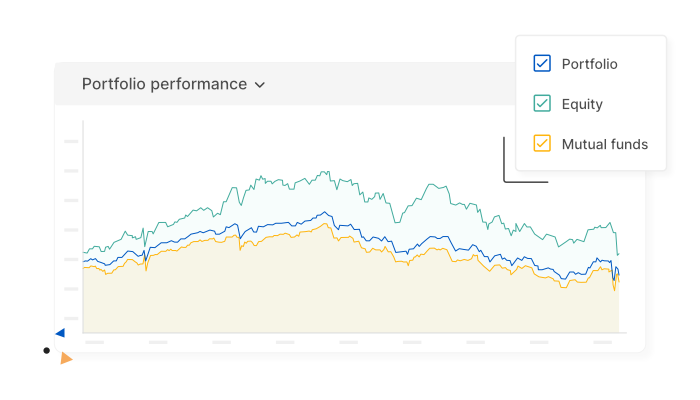
With the Performance curve, you can:
- View separate performance for equities (MTF, intraday, F&O and commodities)
- View separate performance curves for only your mutual funds (MF) investments by clicking on Mutual funds
- Get a combined view (equity, derivatives, and mutual funds) by clicking on Portfolio
- Benchmark against NIFTY 50 to compare your portfolio’s growth over time by clicking on Compare and Nifty 50
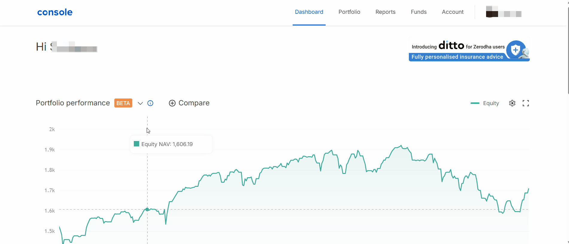
To use the benchmarking feature, simply click on Compare and select NIFTY 50. This will show the percentage change in both your portfolio and the index side by side. You can hover over the curve to view changes for any specific time period.
You can zoom in on any timeframe, and the benchmark comparison will automatically adjust to show performance for just that period.
Account value curve vs. Portfolio Performance curve
| Account value curve | Portfolio performance curve |
| Shows total account value | Shows investment performance |
| Affected by fund deposits and withdrawals | Isolates investment returns by excluding fund deposits and withdrawals |
| Simple sum of all assets | Uses NAV-based calculation |
| Shows absolute monetary value | Better for comparing performance |
The Portfolio Performance Curve is currently in beta. We will be adding more analytics around risk and profitability, along with additional benchmark indexes soon.
If you have any questions about this feature, please share them in the comments section below, and we will be happy to answer them.
Great feature! Can these values come from Kite Api?
nicely done, in the spirit of opensource, zerodha may consider sharing source for this performance compare with account aggregators to allow users to compare across PMS, Apps, portfolios in direct AMC and others…
Will we get a performance curve for ”Family holding”? I want to see performance of complete family portfolio at one place.
This will be a great feature!
Also, there is one suggestion…
If we can compare the portfolio with respect to NIFTY50
– By setting the date of start (manually) for comparison purposes – like 1Jan or 1 Feb. This helps in comparing from some initial big investment amount or some important date we wanna compare.
– By excluding holdings – Like some of the shares which we dont want to include in the NAV calculation curves, which can include a holding gifted, Bond or Gold ETF etc.
Hi Devang, will bounce this off our team. Thanks for the feedback.
Hello..iam not able to access this wonderfull feature on my zerodha trading console portal..plz solve the issue
I know this feature is new and still in beta, but what would be helpful to add in the future would be the rate of return based on the performance numbers. Since the NAV and date information is already available for the performance curve, calculating the XIRR here should be easy.
The drawback of the XIRR on Holdings page is that if we switch investments, the XIRR gets messed up as the date count resets for the new investment and the XIRR information of the exited investment is lost.
This portfolio performance based XIRR will be better than the XIRR displayed on the Holdings page as this would have continuous performance data irrespective of switching investments.
Great feature. However, can you please add the facility to download the data, especially the equity curve, for offline analysis? Also is there any plan to introduce trade diary/ statistics like features in future?
Well don
Keep it up
Please include smallcap index like nifty smallcap 250 index as benchmark. It’ll help us measure smallcap funds. Thank you.
Hi Sumanta, adding benchmark comparison options beyond Nifty 50 is on our to-do list.
Great feature – would be nice if you added CAGR as well, as that is a better way to view multi-year performance than absolute gain..
Superb Feature. Would love to see the performance curve from earlier start dates as well. Description says ’July 1, 2022, or from the date your account first reaches ₹1,000—whichever comes first’, for me its in say 2018-2019 sometime, so shouldn’t it start from then ?
Does Equity include FnO performance as well?
Hi, yes, the Equity performance curve includes F&O performance as well.
Is this feature available on Android or ios apps?
Hi Vinit, this is available on Console. You can view the Portfolio Performance Curve by visiting Console’s Dashboard. https://console.zerodha.com/dashboard
Love this feature. Must have for all brokers. Gove complete visibility into ones actual performance.
Couple of questions, does it calculate correctly when stocks directly goes from account to money, without a broker transaction, like buyback and t bills expiration.
does it include dividends?
Hi Gaurav, dividends are not included in the performance calculation. And buybacks and T-bill expirations are considered to a reasonable extent.
If I have sold a stocks which I bought at 1000 and sold at 1200, then I reinvested this ₹ 1200 to buy another stock. What will be my NAV?
How is there different from XIRR?
In other words, this shows the trend I know but- Is XIRR value same as my current last point of this graph?
Hi shruthi, my pf is in loss, but it still shows nav 1200… please solve bugs
Hi Harsh, could you please create a ticket at support.zerodha.com so we can look into this?
If would be great you can add FD rate also
Kripya zerodha Se Main vinati Karta Hun Ki yah vakra Jo aapane nai Suvidha ke bare mein Bata rahe hain service ke bare mein Iske bare mein Mujhe abhi Kuchh Samajh Mein Nahin aaya hai kripya call Karke Samjhane ka Prayas Karen
Can I compare portfolio to etfs
In the article, it is said that cash inflows and outflows are not taken into account. However I see that NAV is going down when cash is taken out. How to account in that scenario?
Hi Charantej, could you please create a ticket at support.zerodha.com so we can look into this?
Does portfolio NAV consist of ETFs, SGB performance ?
Hi Amar, yes it does.
Please add nifty 500, niftysmallcap, niftymidcap also for comparison
How check in Zerodha. Also excellent information to study
Hi Mahesh, adding benchmark comparison options beyond Nifty 50 is on our to-do list.
Please स्टार्ट 60 day challenge certificate, without free brokerage, and ask govt. To cut/free stt charges
Hi Ravindra, due to regulatory changes, we’ve discontinued the 60-day Challenge, and it’s no longer possible to download the certificates. https://support.zerodha.com/category/console/reports/60-day-challenge/articles/what-is-the-60-day-challenge
ok Thank u
any thing related to STT ?
Great feature and a great time to launch this. Thanks for that and looking forward for many such realistic features that can make us a better informed investors.
please add nifty small cap, midcap index as well for better comparison
Hi Shankar, adding benchmark comparison options beyond Nifty 50 is on our to-do list.
Hi,
Does this also include the equity value increase with the incremental money ? In that case it wouldn’t show the exact comparitive performance right ?
Regards
Shankar.S
Its very nice feature introdus it helpful to all traders
Thanks a lot sir.
This is a great facility at no additional cost. Additionally, I suggest if putting the cursor on the curve can give the PE and Beta values, it would help us to compare these parameters.
Thanks for a nice and useful report.
I was looking for something can give XIRR of benchmark and portfolio by taking into consideration of any realised p&l over a select period. Any suggestions?
This feature help to normal equity investors for assessment own BCD. (Balance, Control, Discipline) in the ocean of capital.
This I have expected for a long time. Now I use my real time XIRR calculator linked with investment journal. Creating the XIRR calculator was not at all an easy task. But nothing is visual in my system. From now the performance can be compared visually in real time. Thank you.
Sir I want to buy e gold receipts how to trade please inform sir
Hi Narayana, we’re working on making EGRs available for trading on Kite. This will take some time. We’ll update you once it is available.
This is a very good feature. I always had this question, how can I trcak my portfolio growth over years, was about to take manual calculattions. Thanks for the update!
Small suggestion in future, hope you can add performance performance curve at individual stock level(in my portfolio), large/mid/small (stocks that i hold), sectoral performance of my portfolio ( eg: whether my banking or FMCG sectoral stocks beat index).
Hi, will bounce this off our team. Thanks for the feedback.
How to apply this,,,? Is it work on holding?
This feature is one more quality step ahead by Zerodha . Please enable one more button in the ’’ Account ’’ page so that investor can get access easily and visualise the curve performance in totality .
👍👍
Does the performance take into account the trading costs involved – demat charges + stt and dividends?
Hi Raghav, the performance curve includes charges but excludes dividends, as dividends are credited directly to the bank
Very nice
Why Nifty 50 only why dont MID and SMALL caps we could have mixed up with all caps please provide those checkbox also.
Hi Phani, we’re working on adding more options, and it’s on our to-do list. Thank you for your feedback, and we’ll keep you posted.
Please improve the chart as in trading view. we can not simply scroll down the company and get the chart in tradingview. Please make it.
Very good feature
When we can expect other index like niftysmall cap and nifty mid cap just like you have aded nifty 50
same from my side also
Hi Soraj, we’re working on adding more options, and it’s on our to-do list. Thank you for your feedback, and we’ll keep you posted.
We honestly appreciate your endeavour to continuously support
Zerodha’s customer, you understand better the need of investors whether it’s regarding income tax or p and L , very nice of zerodha team and Nikhilji.
Thanks a lot 👍
Good feature, but where I can show this?
I stumbled upon this a few days ago and I must it’s a lovely, well thought out feature.
Please show trading a/c portfolio wise.
Nice
We honestly appreciate your endeavour to continuously support
Zerodha’s customer, you understand better the need of investors whether it’s regarding income tax or p and L , very nice of zerodha team and Nikhilji.
Thanks a lot 👍
How I can visualise. Please show the procedure to see it.
Greatful feature. Very helpful.
This is not of any use for trader, rather than this you should add some useful features for trader to enhance trade from chart.
Very nice it’s very useful sir
Great feature. Will calculations also include historical realized gains/losses (i.e. from sold securities)?
If at a later date, the NAV is ₹1,200 and I add ₹6,000, will it add 5 units at current NAV of ₹1,200 like mutual funds or add 6 units at fixed NAV of ₹1,000?
The 1st option should be the correct option and the 2nd option would mess up the calculations so I hope that is not the case but the examples and video were not clear on this part.
Hi Ronak, yes, just like mutual funds, units are added based on the prevailing NAV at the time of investment. So in your example, ₹6,000 at a NAV of ₹1,200 would add 5 units.
Thank you for this feature. The XIRR is nice but it gets reset if I transfer my funds from 1 mutual fund to another. Portfolio performance will help us track the performance irrespective of occasional fund switching.
Hindi me bheja karey
Thanks for this information..
How portfolio performance curve will work,in 2023 I booked 2 laks profite and 2024 I booked 2 laks profited,how this things are reflect in the curve.
Where do I find this option
How to check my FnO performance with this ??? It shows equity, Mutual funds and portfolio…Where’s option to compare FnO performance?
Best indicator services.
Kripya Hindi mein saral bhasa mein samzaye sir
Much needed feature. Thank you.
👍 nice
How to check this in Zerodha
If the performance is not reasonable how can it be rebalanced
Will you give assistance
Okay sir, it may be helpful to me also
How to see
Thanks. Will appreciate more if stock wise comparison .. is also provided
Hi Sukanya, thank you for your feedback. We’ll look into the possibilities.
This is new to me
Thanks
I recently transferred some shares from another DP to Zerodha and the analytics seem to break. Its a very cool feature that zerodha has introduced, waiting for these things to be fixed and more analytics in place but I am so happy that we are in right direction. This was so much needed !!
Please inform how to check performance curve in Console
Where to find portfolio performance curve in console
Agree, How to use it and how to read and interpret it is also important.
Sandar… Bahut Badhiya..👍
Great work as usual! Commitment!
Zerodha should be start a compilation just likes dream 11 (ipl team).
:Long time best promer should be reward.
Whether return are pre-tax or post tax considered?
Yes good idea and guidance
Pl tell how to check in zeeroda
Nice feature.
Very good idea
Thanks for your commitment towards investor,
Super. Enlighten customers like this from Time to Time for better results
Avi market ka jo candistion hai 2029 tak portpfio ca kaya candistion rhe ga 25Lx my investment hai
Very nice and wanted feathers
So tell us in simple words, what does it mean ?
Does it mean that 1000 is your cost or base value or investment and any value over that is your profit or below that is your loss ?
How does is compare in terms of returns calculation CAGR or IRR wise ?
Of course the performance in terms of comparative returns against a benchmark and relative volatility or return per unit of risk taken etc would be definitely helpful.
Thanks for bringing some perspective on performance.
When you say you buy units for every additional investment at previous NAV it is confusing … so does it reflect my average cost of acquisition ? If so how do we figure the profits ?
Really Good Feature
Will us better idea of investment.
Nice and a snapshot of investments.
Yes.its useful marker
Would love to the mathematics behind this …
Finally you guys did it! Thanks a lot zerodha! Just another small request. Can you also please add other benchmarks to compare like nifty smallcap 100 and nifty midcap 100 please.
Very nice. This will be the most relevant chart to look our for. Thank you.
How to connect to console and do actual what u say guide plz
Pls include feature to display realized profit and loss also and portfolio of zero balance stocks to show the performance of past held stocks .
This feature is there in ICICI direct.
Good feature but if you make changes to colors of Nifty 50 curve or introduce more color options which we can select then it will have a good visibility. Also, if you add one more feature in charts like suppose if we click on any stocks in our holdings then it should also show on charts when specific investment was made in that particular stock just like you show on mutual funds. This will be more helpful to know whether we invested in that particular stock or ETF when it was down. I have written about this earlier too. Hopefully, you will incorporate these changes too.
Thanking you in advance.
Savitri Joshi
what is that
Hi Savitri, thanks for the feedback! We’ve noted the suggestion on color customization and better visibility. As for showing the buy point on stock charts similar to mutual funds, it’s already on our to-do list.
Good feature would love to see it on kite
Very nice
when portfolio have large cap, medium cap and small cap stocks how will i compare it with nifty 50
Thanks for pointing that out. Adding benchmark comparison options beyond Nifty 50 is on our to-do list.
Thank you zerodha for the Portfolio Performance Curve. Great features.
Very Good Initiative… Hsts off….Similarly,u display the Face Value of the shares in the Portfolio screen..my long pending suggestion to which Z routinely replies – forwarded to Development Team…never saw the light till Today 😀😀I don’t understand why this hesitation, Team Z !!??
Hi Venkatesan, we’ll take this as feedback and pass it along to the team.
Great feature.
Nice feature, please add predefined time duration as well, like 1D, 5D, 1 W, 1M, 3M, 6M, 1Y, 3Y to see PF performance. This will help in easy navigation.
Hi Ravi, thanks for the feedback. For now, you can use the zoom in/out feature to navigate through time ranges.
Add This Feature in Kite App – Top Gain & Top Lose Lists in Pre Market Session and After Market Opened List.
Hindi bhasha me bhejiye, english me kuch samzta nahi
Really, I was waiting for this.
Hi Zerodha ,
When you are planning to introduce US stock market just like groww did ?
Please just concentrate on brokerage, anything else is waste of time
How can we use this feature?
Hi zerodha,
This was much awaited feature. Thanks.
Is it possible to add different benchmark indices? Like atleast Nifty500
Thanks
Praveen Aruru
FROM 2020 It will give us a much more realistic view of the portfolio than July 2022..
Vary nice
Historical profits and losses booked should also be captured so that it’s truly holistic
Good step. Pls fine tune further
Is the profit/loss of future and options also factored into the overall portfolio performance
I don’t think it’s meant for that. It is surely an excellent tool to know your total portfolio performance.
Good one👍, thank you
No no comments
How can I see performance for equity, F&O and both combined? I want to see in 3 different comparisions.
How and where do we see this curve
On the mobile app, it’s under console> Portfolio> Dashboard.
Great!
However, we are still awaiting the ’Orders’ on chart feature. (buy/sell order, SL, Target all on chart at the same time).
Cheers!
Request to add future: Please display the number of days and quantity as per fifo order in the portfolio that helps during selling and tax harvest or else auto apply the taga to all stocks instead of we applying to each script
Hmm , wow nice a good minor update. Keep working
My ZERODHA newly opened but not completed ac not opening
Kindly do the needful by giving me the contact person.
Better create a momentum powered portfolio and send on a weekly basis to all investors—say HNIs with a minimum of say 10) investment in Zerodha–so that they can correct mistakes on a weekly basis and move along with the market and ride over the momentum plays
Bahut badhiya
For calculating NAV what is considered as the capital?
Is it collateral (after haircut) + cash is it total account value (cash + investment value without haircut)?
Also, earlier portfolio performance was available from 1st Jan 2020. Can you please reintroduce it from that point instead of July 2022?
*is it collateral (post haircut investment value) + cash OR is it total account value (investment value + cash) ?
Hi Aamodh, NAV is calculated as the total current holdings value including pledged shares (with haircut) + cash balance + FO positions value (if any).
As for portfolio performance, it’s currently available only from July 2022 onwards, as the data from this point is cleaner and supports better analytics going forward. However, we’ve noted your feedback. Thank you.
Nice and a snapshot of investments.
Thanks for the response.
Hope the feature is introduced from Jan 2020 someday again.
FO postion Value or the margin blocked for Fno.
If i have future , margin blocked would be arount 20% but Future value would be 100%
This is something I was looking for such a long time.
Well done. Glad to have this.
Excellent work,nice guidance.
Great feature, one more milestone 😃
Truly evolving
Bahut badhiyaa 👍
Shandar La Jawab
Great feature
Great🙏🌹👍👍🙏